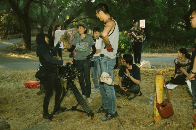
Anna and Dan
Art is not always about the abundance of expression. Sometimes it is about being straightforward and the beauty in the simplicity. Pablo Picasso’s “Dove of Peace”, “Blackbird” by The Beatles, there are numerous examples in varied mediums of art which exhibit the power and effectiveness of restraint coupled with sincere emotion. Production designer Yuntong Peng utilized this approach in her work on the film Anna and Dan. What is so striking about Peng’s work on this film is how her minimalistic approach perfectly complements the emotional tone of the two main characters. Though Yuntong has contributed her talent to productions ranging from award-winning thrillers like The Girl in the Garage to national news channels such as Changsha News, and others, this heart-wrenching tale of two wounded people seems to be where the understated side of her work shines most brightly. Awards from WorldFest-Houston International Film and Video Festival, Festigious Los Angeles, Hollywood International Moving Pictures Film Festival, and others confirm as much.
In the story, Anna is experiencing PTSD from a serious car crash she was in which claimed the life of her grandfather. She spends time by herself in the forest and eventually meets Dan there. Slowly, a sincere friendship is kindled which lasts until the day Anna receives the news that Dan has died. Dan’s mother reveals to Anna that he was in agony for quite some time but hid this from her. She is moved to embrace a positive outlook because of Dan’s influence in her life. Yuntong wanted the design of the film to convey the private and isolated atmosphere to the audience without being too heavy-handed. Production design is the most visual way to watch films or stories, communicating a great deal without actually saying anything. Peng subscribes to the premise that production design is storytelling psychology.
For the forest scenes, Yuntong kept things to a minimum in order to maintain a natural look as well as not harm the environment. Well-arranged flowers, branches, and trees were more than appropriate for this realistic setting. For Anna’s house, Peng created a comfortable and dreamy place. Paintings of Dan hung on the walls, an obvious sign of his impact on Anna. While physical structures and props may have been essential, a huge part of Yuntong’s approach was in regards to color. She reveals, “The most important thing for me was to add some color into this film. There is a fantasy element to this story and I wanted the forest to look full of life. I planted some flowers in the forest and added a blue bench. During one wide shot I had the actress playing Anna hold a red balloon, which really made her stand out. My aim was to make this world colorful and interesting without complicating it. I also used this concept in my design of Anna’s room. I wanted to emphasize the contrast of color by using red and blue.” She continues, “I also used color to present the conversion of emotions in the two main characters. For example, I used more black and white color for Anna and more high saturation colors for Dan in the beginning. I coordinated this with the costume designer concerning their wardrobes. In the film, the audience may notice the colors used for Anna and Dan evolve as the story progresses. I used more warm colors for Anna and cold colors for Dan. This subtly conveyed the information that Anna was getting better and also hinted to Dan’s tragedy in the story. Audiences can see more and more color in Anna’s part, the orange dress, the yellow flowers, the purple butterfly and the red balloon. I wanted the viewer to see the world changing and becoming more positive, beautiful in the way that Anna also begins to see it.” Details such as these illustrate how intrinsic and vital Yuntong’s work was in assisting audiences to feel the full power and intensity of this award-winning film.
Author: Kelly King


